Ed Copony
Geospatial and Cartography
In 2020, I started getting more interested in data science. That journey led me to geospatial data science. I started teaching myself the basics, then eventually decided to enroll in a formal program to speed things along. I started a master's degree program in 2021. Here are a few of my creations from my journey so far.
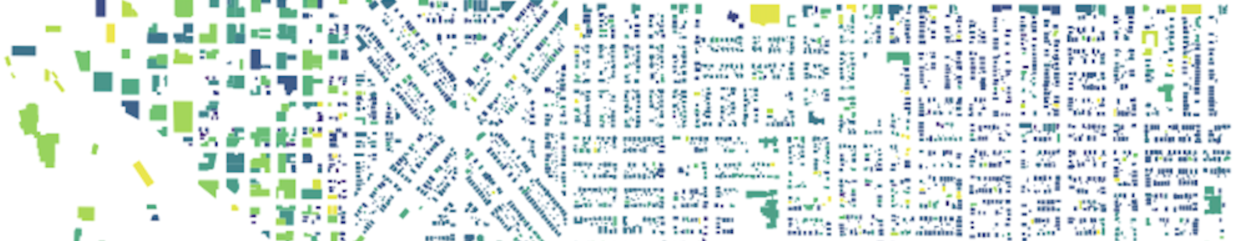
The banner above is from one of the first maps I made when I started out and was learning GeoPandas on my own. It's a map of all the buildings in my neighborhood in Portland, colored by the year they were built. Even though it was pretty much just out-of-the-box GeoPandas with no special effort put in, I thought it was pretty cool. Older buildings are darker, newer lighter. My previous house and my current house are both visible and are on the far ends of the color range: 1910 and 2015. The building data came from PortlandMaps Open Data (https://gis-pdx.opendata.arcgis.com/)
Maps from my master's research component
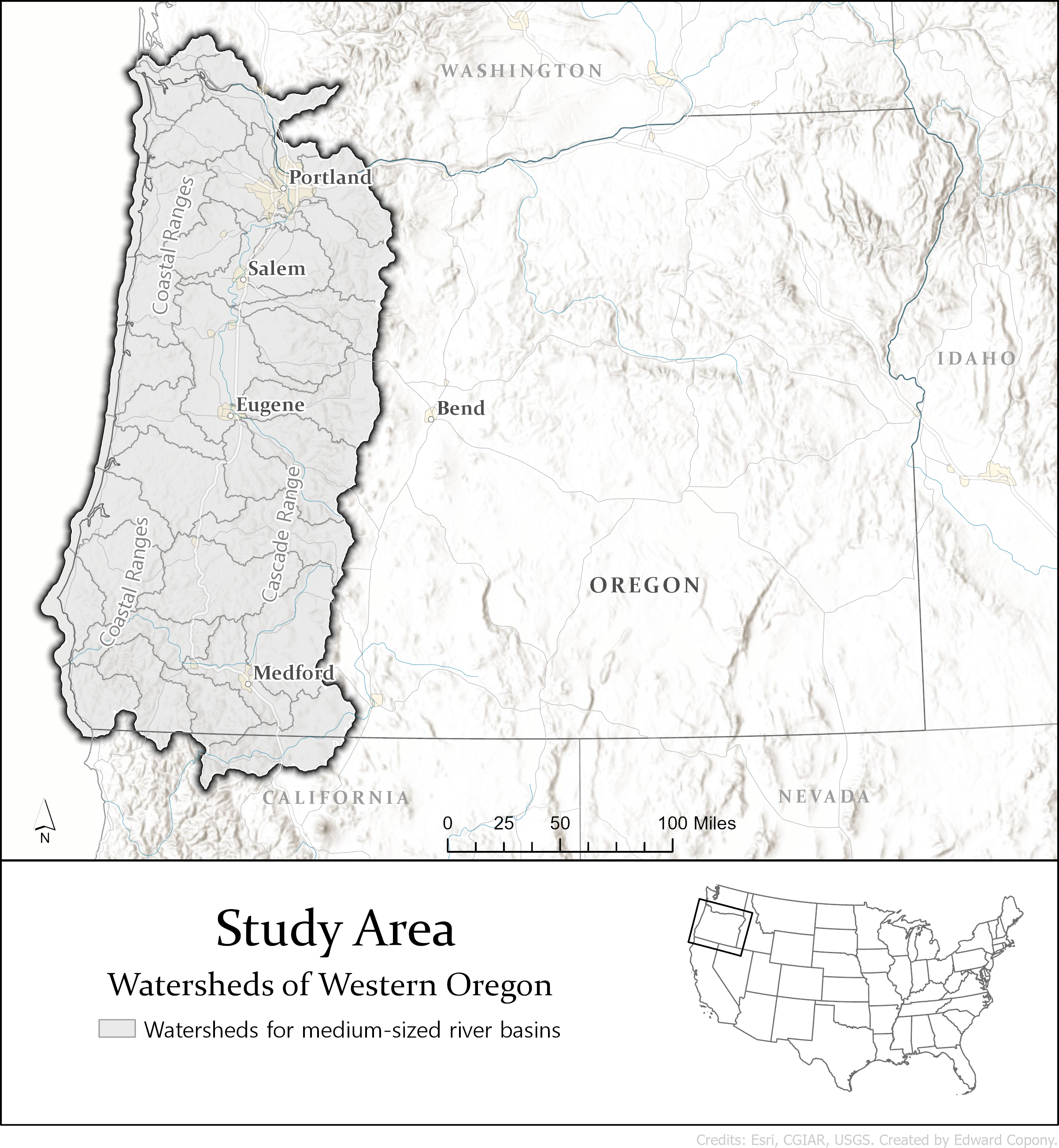
For my master's degree in Geographic Information Science, I completed a research component. After exploring a number of potential ideas, I settled on the topic of river restoration project planning, specifically river restoration projects involving the use of beavers. For my study area map, I wanted to create a simple base map that I could continue to use for the rest of the maps in the project.
The objective of my project was to build a prototype of a tool that could aid in the strategic planning of beaver-oriented restoration and conservation efforts considering the context of climate change. To do so, I combined the output of an existing model for estimating restoration opportunites for beavers on stream segments with more strategic-level data around climate impact and additional project risks.
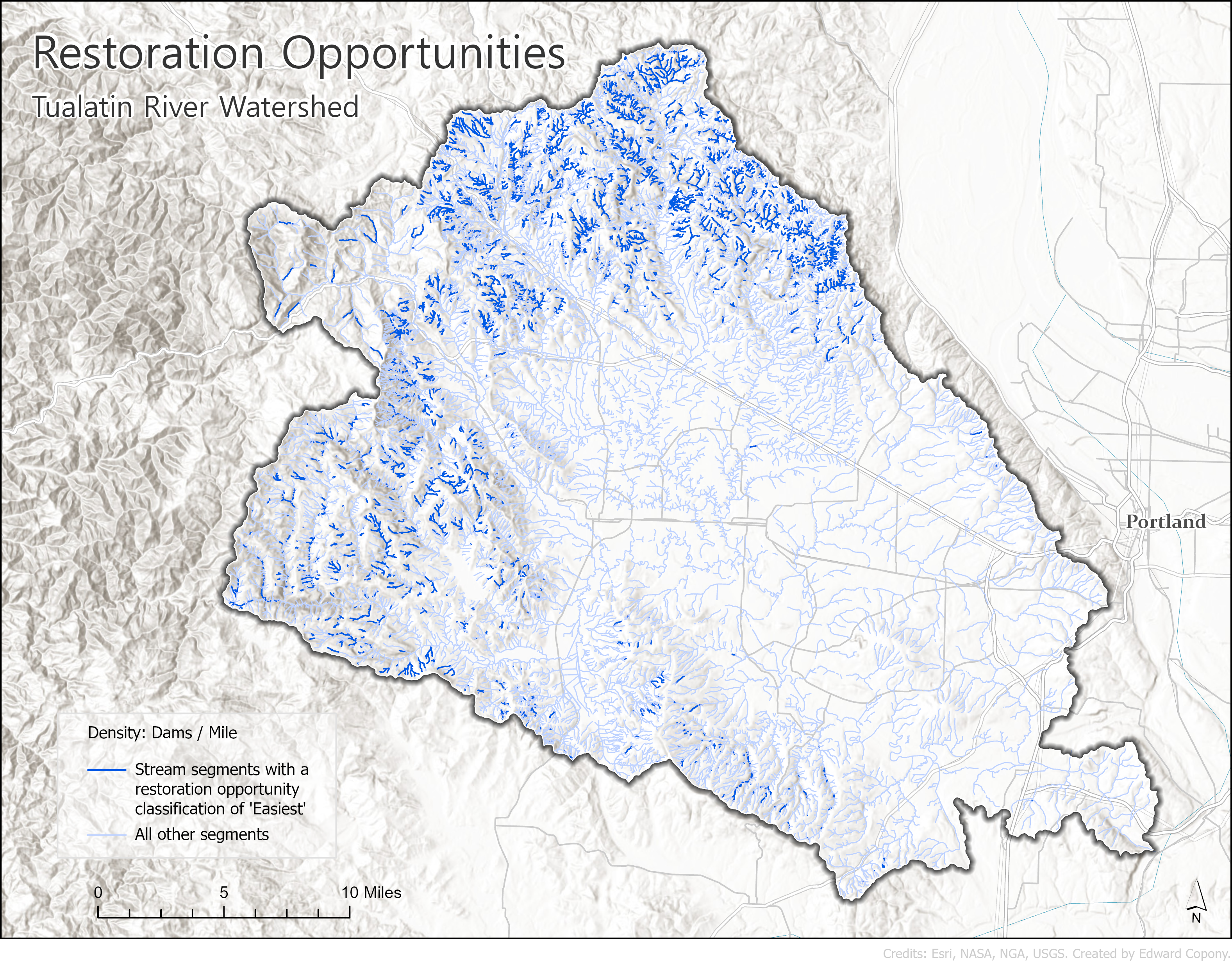
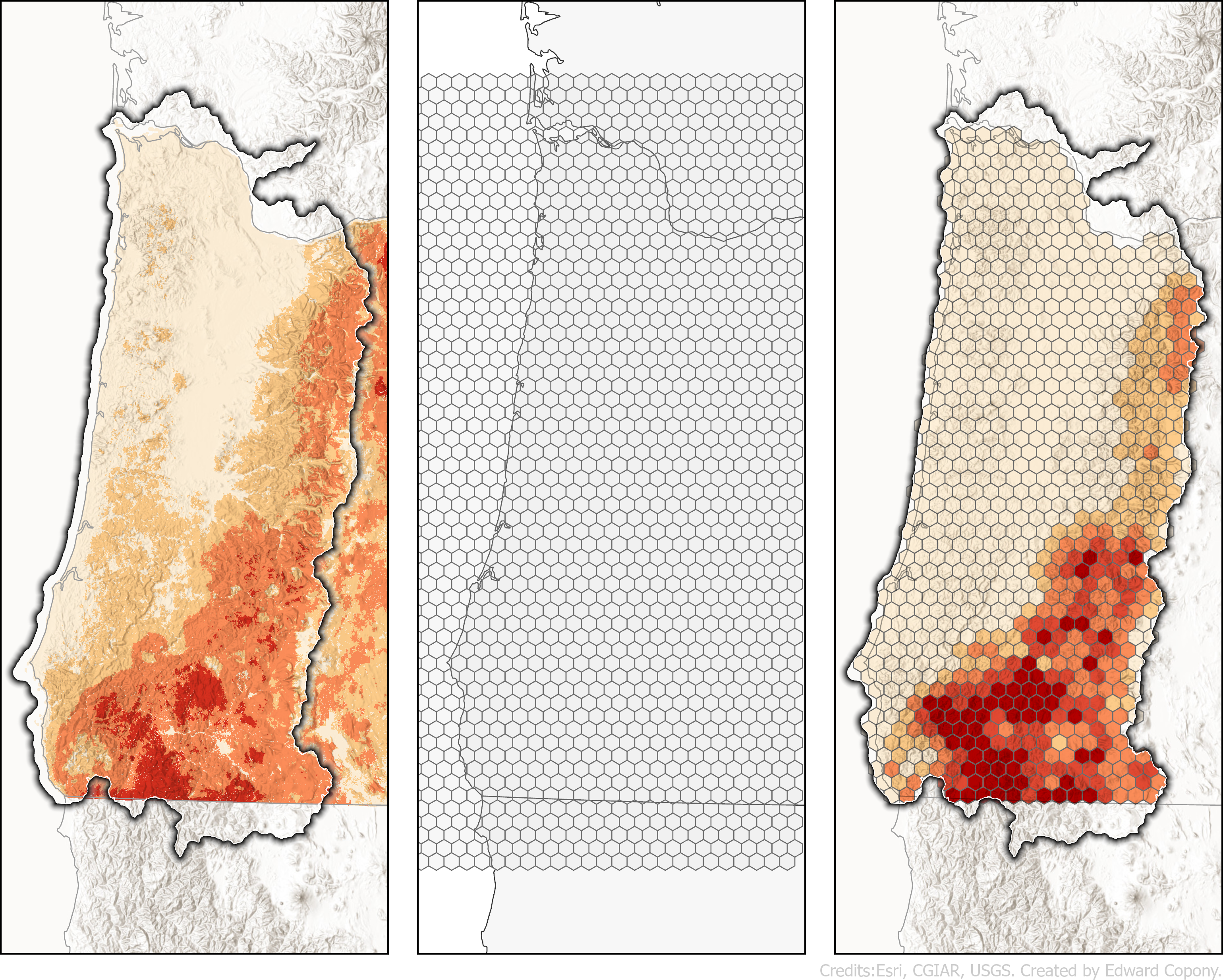
For the restoration-project data I used the Beaver Restoration Asssessment Tool (BRAT). BRAT was initially developed in concert with a study in 2017 and has since been open-sourced. BRAT can produce a number of different outputs, but for my project I was interested in the restoration opportunites. The following is an example of this output from BRAT from one of the watersheds in the study area.
For strategic climate-impact data I used wildfire risk data from the 2018 Pacific Northwest Quantitative Wildfire Risk Assessment and drought data from the U.S. Drought Monitor. For project-risk data I used predator-range data from the U.S. Geological Survey and forest loss data from the Hansen/UMD/Google/USGS/NASA Global Forest Change partnership.
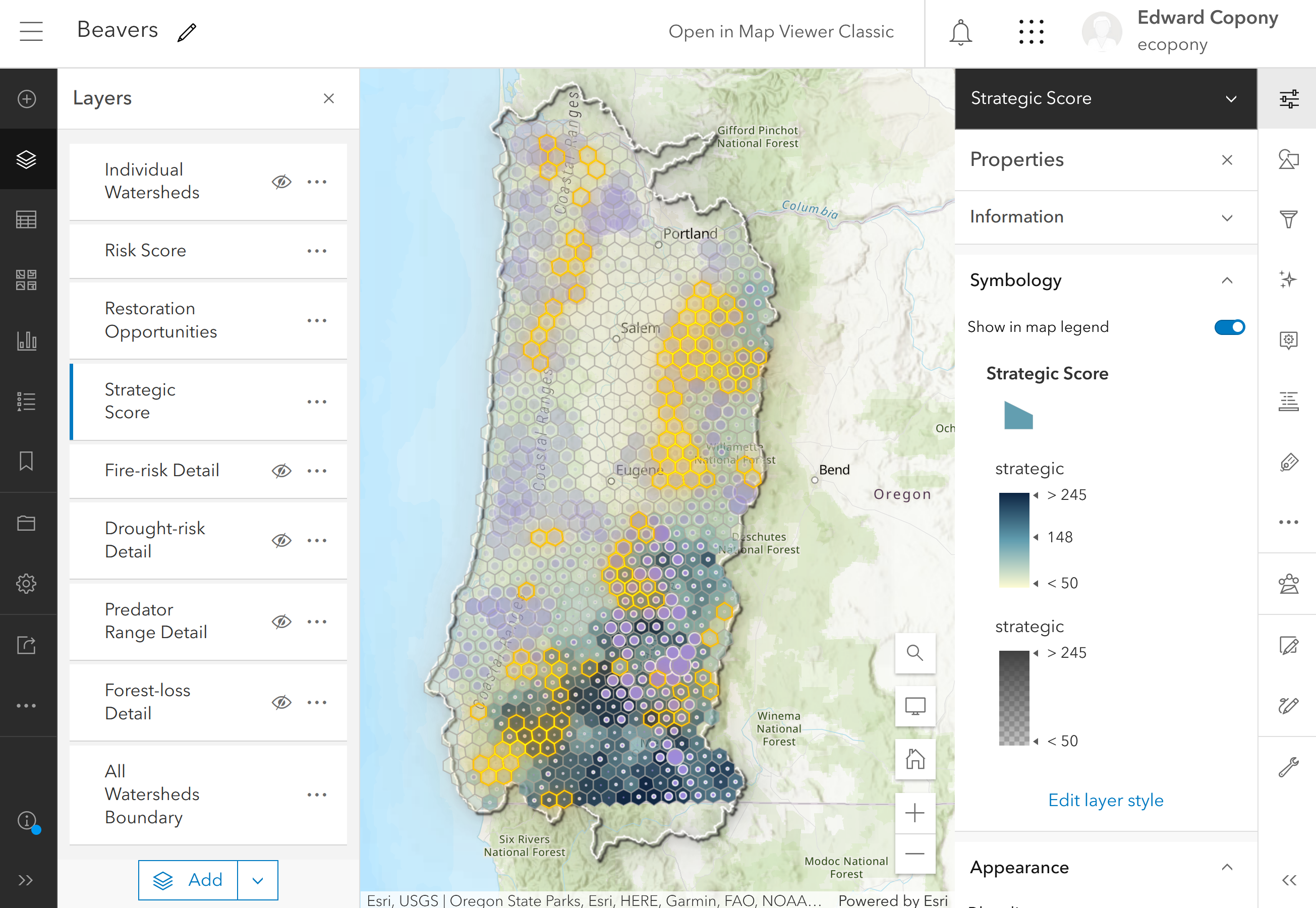
To combine all of these layers, each category of data was joined with a tessellation layer of transverse hexagons each covering 100 sq km of the study area. This allowed for all categories of data to be analyzed and compared over uniform areas. An example using the wildfire risk data is shown below.
From the opportunities and climate data I generated a strategic score, and from the risk data I generated a risk score. I combined everything using ArcGIS Maps Online for the prototype.
The strategic score is represented by the hexagon fill (blue to transparent blue). The risk is represented by the hexagon outline (orange to transparent orange). The number of restoration opportunities is represented by the purple graduated symbols: size for number of opportunities and transparency for the strategic score to demephasize high-opportunity areas with low strategic value. The symbolization allows for planners to identify areas with high strategic value (because of the risk posed by the impact of climate change) with lower levels of project risk. See annotated areas below.
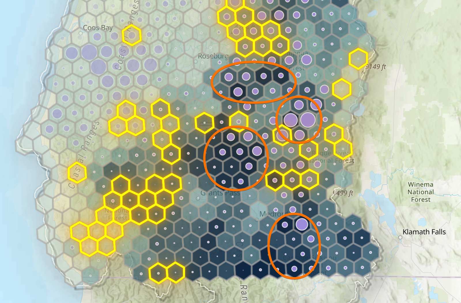
The symbolization also highlights areas that might have high numbers of restoration opportunities, but less strategic value (e.g., the northwest corner of the study area).
Cartography lab assignments
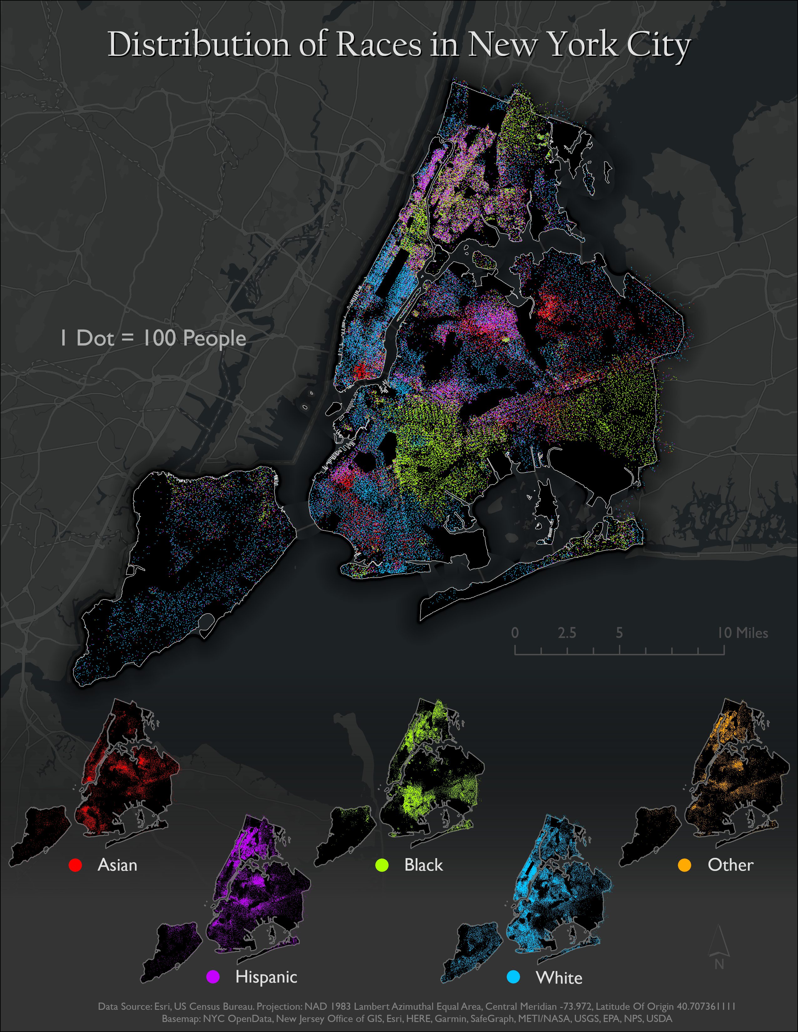
For my master's degree I took a class called Cartographic Design and Visualization. The next few maps are some of my favorites from the lab assignments for that class. The first map below was completed for a module on symbolization. The challenge of this assignment was coming up with dot-density symbolization that didn't misrepresent areas: getting the colors, the dot size, the drawing order, and the ratio of people-to-dots right so that they all worked well together. I made this one in ArcGIS Pro.
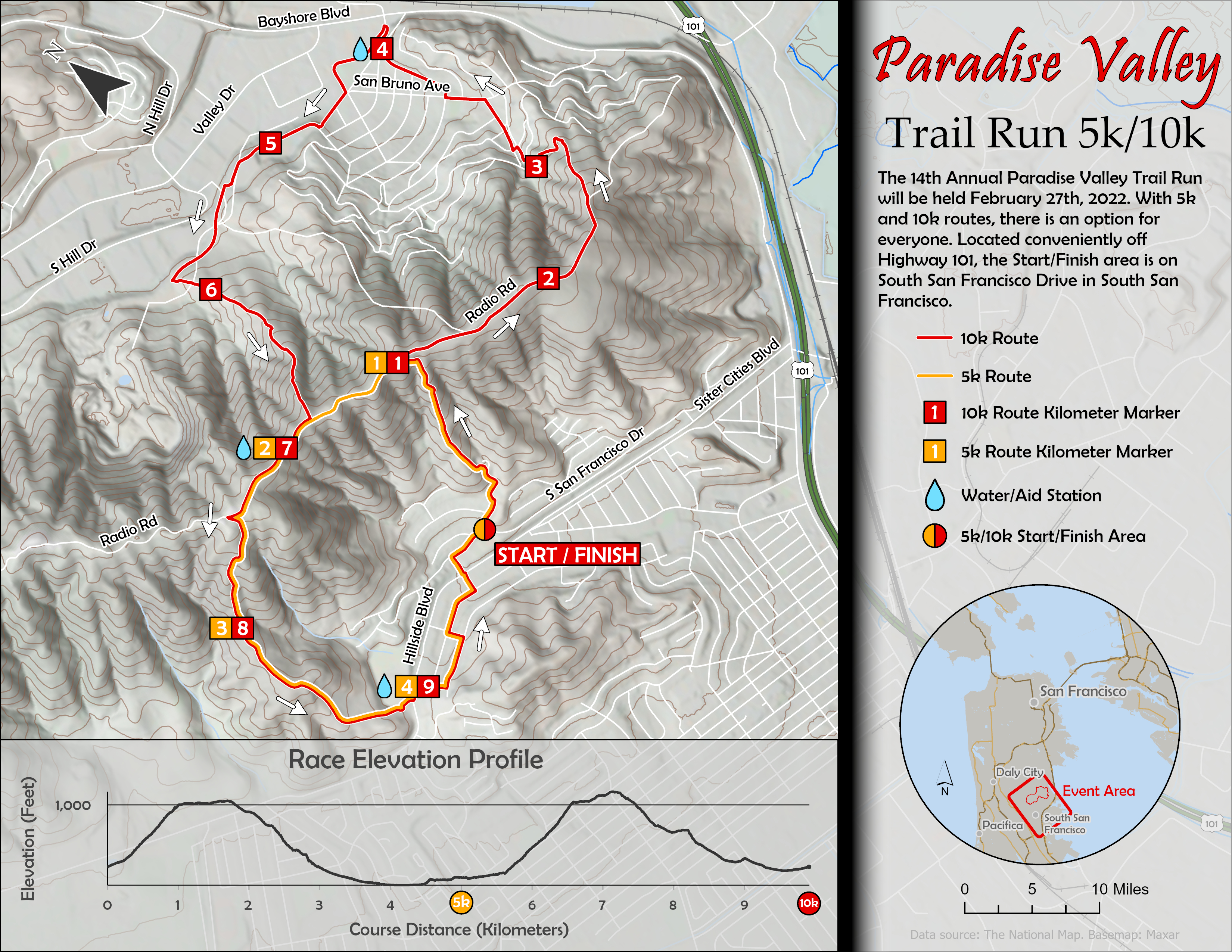
The next map was also made in ArcGIS Pro. This one had a few different requirements. First was styling the elevation: We had to work in hillshade, multi-directional hillshade, coloring, and contour lines. We also had to fit in the race elevation profile, locator map, and come up with the race-course symbology for overlapping 5k and 10k routes.
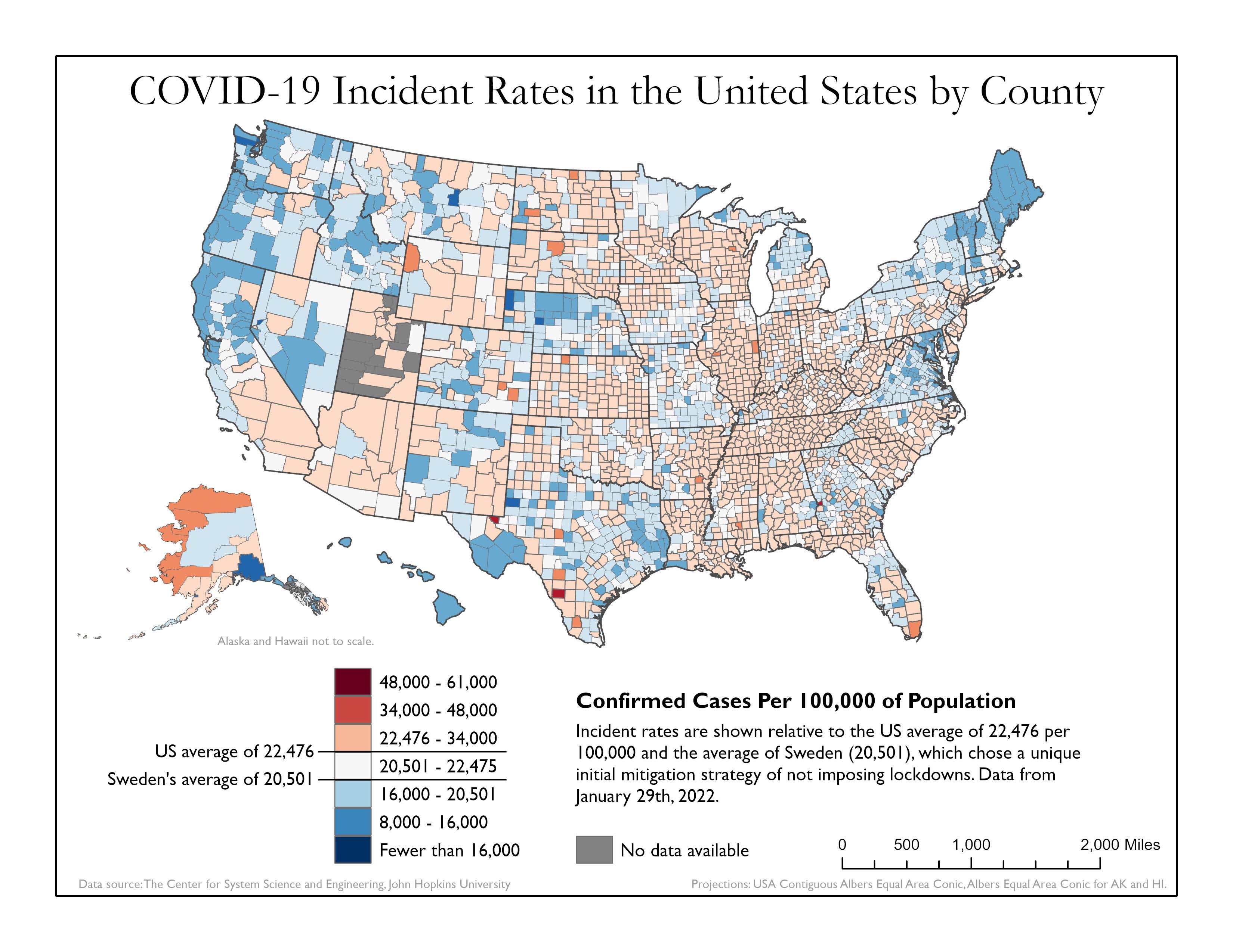
For the next map we had to make a choropleth map with two critical breaks and a divergent color scheme. I now understand the downsides to choropleth maps, but I've always enjoyed looking at them. This type of map is one of the things that drew me into geospatial in the first place.
Other assignments
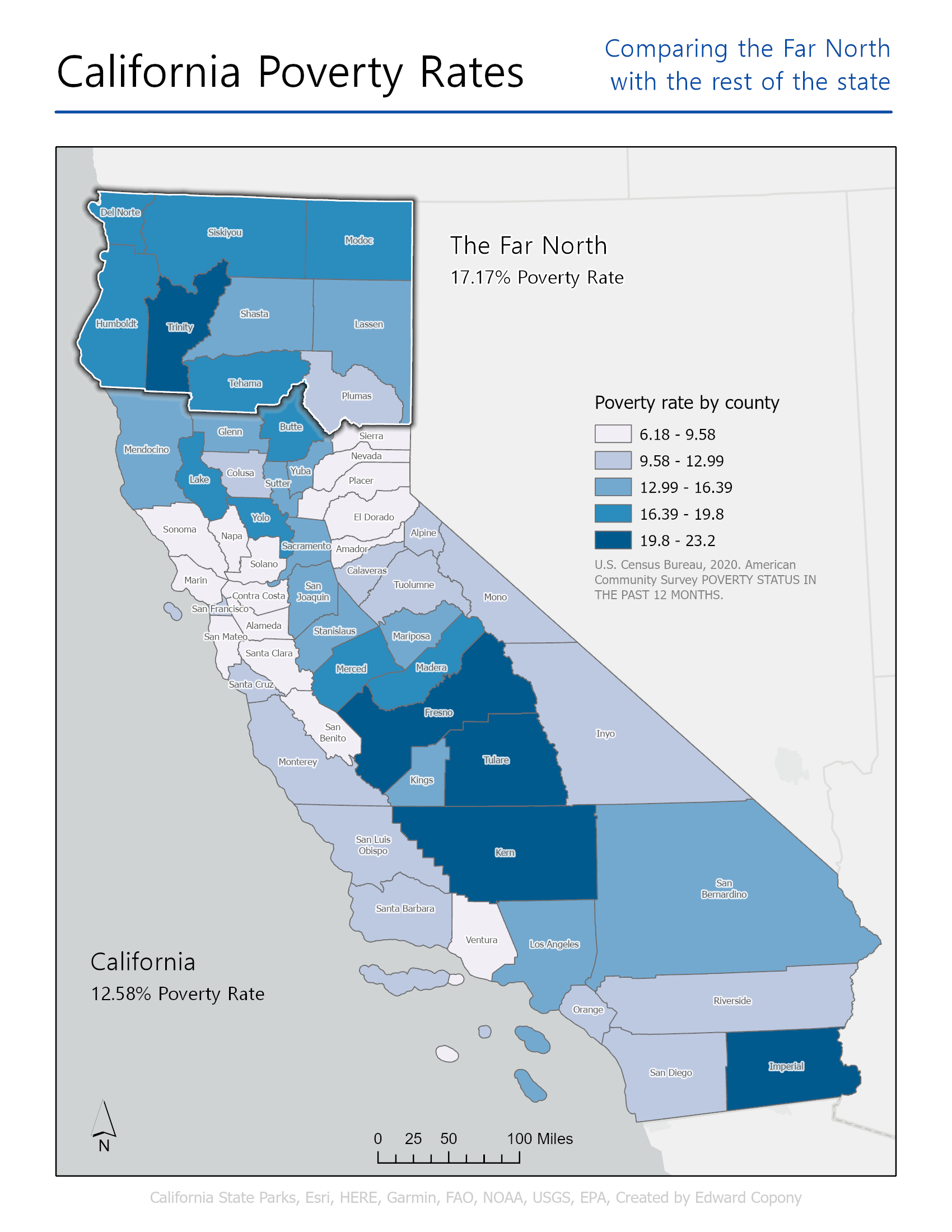
The next map was part of an assignment for Geostatistics. The assignment was about hypothesis testing, and we had to make a map to go along with the test. I didn't spend much time on this map, but I thought it turned out well and I got a lot of positive feedback on it from my classmates. A classmate asked how I made the symbology for the Far North (a technique I learned from watching John Nelson's YouTube channel) so I put together a quick tutorial for the class. The answer to the hypothesis test: Poverty in the Far North of California is statistically significantly greater than the rest of California.